Five Marketing Predictions for 2025
Jan 2, 2025By this point, most marketers have become accustomed to the never ending whirlwind of change and evolution in the digital…

Just in case you missed it, in July 2024, Google made the shift to mobile-first indexing, meaning websites that fail to perform seamlessly on mobile devices will risk penalties or even removal from Google’s search rankings.
This change is designed to reflect the growing dominance of mobile internet usage, with more users now browsing on their smartphones than ever before.Essentially, mobile-first has set a clear mandate for website owners – get mobile-friendly or risk putting your business website at a significant disadvantage.
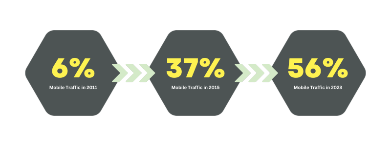
Did you know that in 2011 only 6.1% of website traffic came from mobile devices? A relatively low percentage right?
Well, in 2015 that figure had risen to 37.2%, by November 2023 traffic from mobile devices accounted for 56.2% of total web traffic and fast forward to January 2025 mobile users now account for 62.69% of global web traffic.
Long story short, the rise of mobile internet usage is staggering and it won’t be slowing down anytime soon.
This makes it more important than ever to ensure that your website is mobile friendly, and with over 59% of all google searches also originating from mobile devices, your site needs to offer the same efficient user experience to those on mobile as it does on desktop.
The harsh reality is that despite the figures laid out above, many websites are still lagging behind when it comes to mobile optimisation, and the consequences are becoming impossible to ignore.
Google considers the mobile performance of a website as a major ranking factor, making it crystal clear that mobile-first is no longer optional. Simply put, if your website performs poorly on mobile your SEO and google rankings will be adversely affected.
Lower search rankings
Prevents your business from being discovered when it matters most. Google prioritises mobile-friendly sites in its results and if you’re not optimised, you’re being left behind.
Poor performance
Drives visitors away before they even have a chance to explore your offerings. A frustrating mobile experience can turn a potential customer into a lost opportunity within seconds.
Missed leads, conversions and sales
Lost opportunities mean you’re leaving potential growth and revenue on the table, simply because your site doesn’t meet the modern user’s expectations.
The good news? As an all-in-one B2B digital marketing, our team at Extramile can give you the power to adapt your business’ website for mobile and ultimately stay ahead in an increasingly competitive digital space.
Mobile-friendly design is the practice of creating websites and digital experiences that are optimised for use on mobile devices, such as smartphones and tablets. This approach ensures that content is displayed correctly regardless of screen size, delivering a seamless and intuitive experience for users.
By prioritising usability and accessibility, mobile-friendly design not only caters to the growing number of mobile users but also enhances overall engagement and satisfaction. It’s about adapting to the needs of modern audiences and ensuring your digital presence remains effective and competitive in a mobile-first world.

Optimising your website for mobile devices involves addressing various technical aspects of your website. The items listed below are some of the most important areas to adapt to ensure that your website is fast, smooth and user-friendly on mobile devices.
Responsive Design
Use custom CSS to make sure your website layout adjusts dynamically to different screen sizes and orientations.
Implementing a custom CSS allows for a more responsive design. This means that your site can quickly adapt to different displays, providing an optimal viewing experience for your users.
Optimise Images
Ensure that your images are in the right format. For standard images and photographs, use JPEG, and for simple graphics, consider PNG. For icons or logos, SVG files offer an efficient and scalable file type.
Images should also be compressed to reduce file size and improve load times. Compression tools such as TinyPNG make image compression easy and effective.
Mobile-Friendly Navigation
Simplify navigation for mobile users. Utilise mobile-friendly navigation patterns, such as hamburger menus or bottom navigation, to make it easy for users to find information without overwhelming the screen.
Touch-Friendly Elements
Elements on your site, such as buttons, menus and links, should be easily tappable.
It is also important to remember to make sure that there is enough space between elements to allow easy access and prevent accidental clicks.
Mobile Optimised Forms
Simplify your forms for mobile. This means minimising the required number of fields and including ‘auto-fill’ features to make the process seamless for users.
Arguably, the most important factor when it comes to mobile optimisation is testing.
Conduct usability tests on your website, identify pain points and gather feedback from users, also remember that although you’ll be developing your site on a desktop, to perform your testing on different mobile devices to gain the most accurate results.

As we’ve shown, the importance of user experience for mobile devices is essential to having a successful website, especially for businesses.
As smartphone use and mobile browsing continue to grow exponentially, businesses, particularly those that rely on Ecommerce, cannot afford to overlook the importance of providing an excellent mobile UX.

At Extramile Digital, we specialise in designing future proof websites for businesses that want to lead, not lag. From responsive design to user-focused strategies, our tailored mobile-first solutions ensure your site meets Google’s standards while delivering a premium experience for your users.
If you want support creating a user friendly website for your business, contact our team to discover how our experts can elevate your digital performance.
Want to learn even more about the importance of user experience? Check out our other articles below!
Because most users now browse on the go. Google wants to ensure search results provide the best experience possible, which means prioritising websites that cater to mobile users.
The consequences could be drastic. Your site may no longer appear in search results, leading to a significant drop in organic traffic and overall visibility.
Yes, but only when paired with mobile optimisation. Google’s bot will still crawl desktop versions in rare cases like job postings or product listings.
Absolutely. With our expert support, you can adapt quickly, implementing responsive designs better navigation and boosting your online presence.

By this point, most marketers have become accustomed to the never ending whirlwind of change and evolution in the digital…

We’re working in an incredibly exciting time for SEO, driven by advancements in technology and the ability to harness powerful…

On the 10th July, 2025, Instagram posts will become visible in Google search results, creating unique opportunities for savvy businesses…

If you’re managing social media for a business, you’ll know that success comes from strategy — not spontaneity. That’s where…